The Barn at Victory Ranch is a haven for families, health aficionados and—indeed—decorative daydreamers. Each interior space, from The Parlor to The Spa, exudes an ambiance that’s simultaneously authentic and upscale, all by virtue of Karen Herold and Alicia Kelly’s impeccable designs. Chicago-based designer and founder of Studio K, Karen Herold is renowned nationwide for her work in both restaurants and hospitality, including her many celebrated designs throughout Victory Ranch.
As such, it should come as no surprise that Karen and Alicia, designer and project manager at Studio K, brought this same effortless flair into the grandeur of The Barn. To understand how each flawless space came to be, we sat down with both Karen and Alicia to get a coveted inside look into their process and how their emotional attachment to Victory Ranch is just as important as each minute detail throughout.
The Barn is Victory Ranch’s newest amenity, yet the designs throughout evoke a sense of timelessness and authenticity. How did you create an ambiance that feels both new and well-worn?
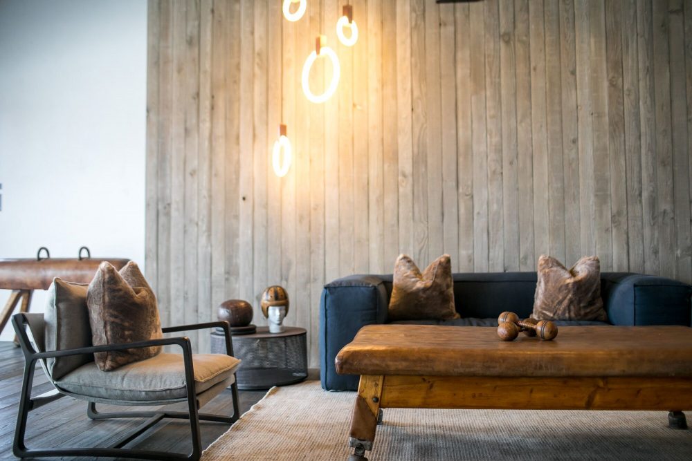
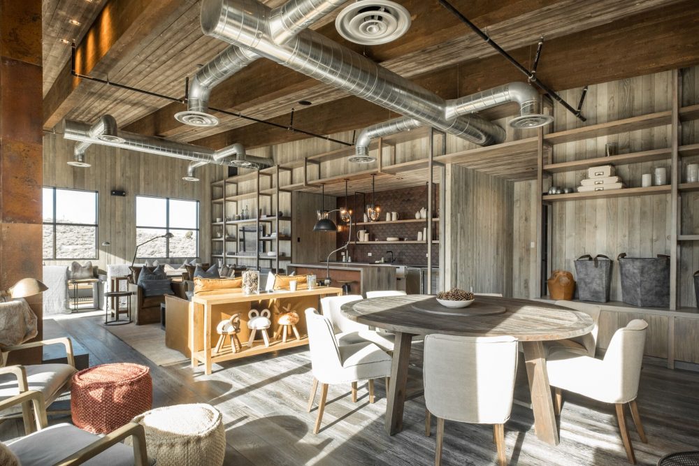
Karen Herold: In the way that we do any job, we start with authentic materials. We use real wood, not wood-like material. And, while we are designers, we try not to be; we strive to design in a way that results in something aesthetically effortless, asymmetrical, unprogrammatic. This is especially evident in photographs. For example, The Parlor comes across as chaotic in photos—but that’s what makes it so authentic and well-worn in person. We wanted to make it feel comfortable for everyone, whether you’re two or ninety years old. It’s super casual which makes anyone feel welcome. You don’t want the design to overrule the experience; so, we take on the anti-designer role and try to imbue a space with personality.
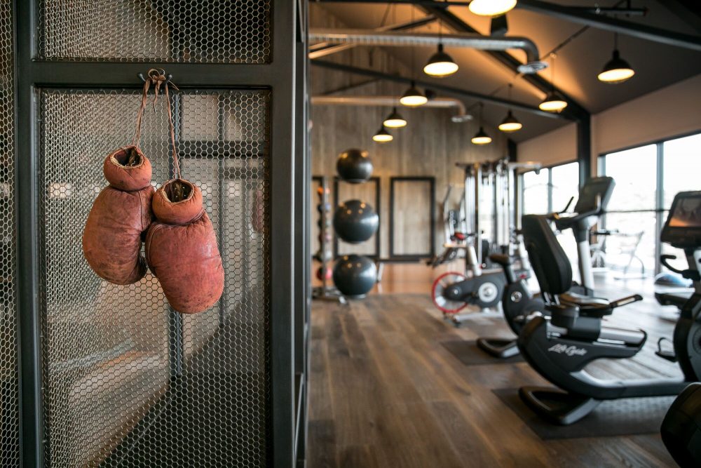
Alicia Kelly: What happens in a lot of our projects is that we do multiple stages of layering, which usually entails found objects combined with newer things. You’ll find pieces throughout all of The Barn that are truly vintage, like the pommel horse bench in the Fitness Center, which create an authentic feel. Then, we’ll add in another layer of modern objects, so that way it feels current. It’s this way of curating new and old items that really does the trick.
We understand that you both travel quite a bit and pull inspiration from places and experiences. Was there a particular destination or experience that inspired your designs for The Barn?
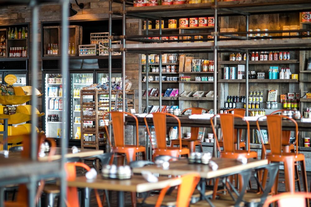
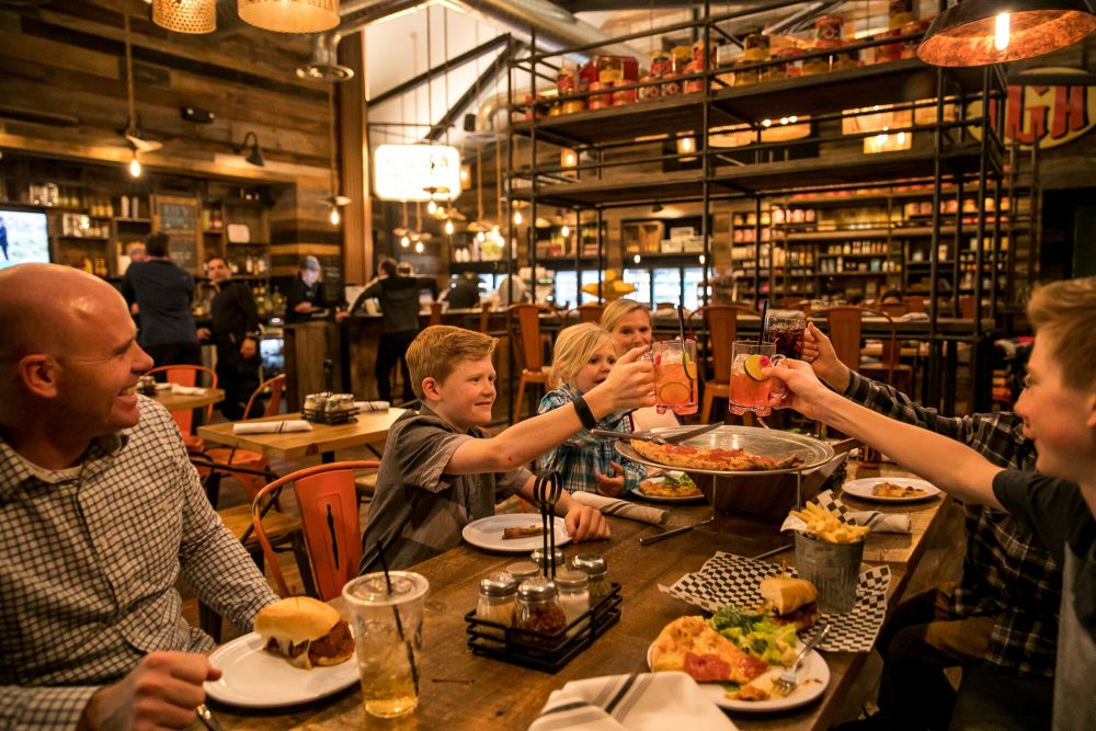
KH: Our inspiration was actually drawn from Victory Ranch itself. We’ve been on this project since the very beginning, and we all agreed that we wanted it to come out as modest as possible. We wanted to be sure that our designs were not an exhibition of wealth. Instead, everything was meant to feel good. There are no shiny materials, there is nothing over the top—although of course, you have the pizzeria—but everything just feels modest. Part of what we’ve done is inspired by typical mountain design in Northern Europe and chalets in the Alps, but it’s been modified to fit Victory Ranch’s own location in Utah. The authentic ambiance, enlivened by pieces that have already had a life, is luxurious in and of itself.
From the Spa to the Parlor, the details throughout are simultaneously modern and rustic. How would you personally describe this design concept and process?
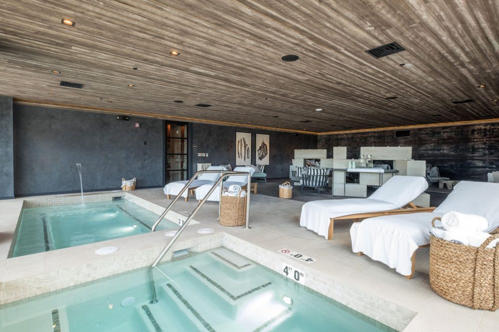
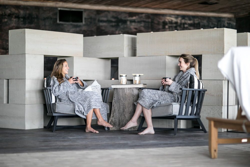
KJ: The star is the size of the building. You have to be 18 years or older in the Wellness Barn, so that building has a far quieter ambiance than the Family Barn. All of the architectural elements have been given a lot of attention and detail, complete with high-end, top shelf finishes, resulting in a design that’s both simple and luxurious. But then there are intricacies. The Spa stairs, for example, have a reveal of black steel instead of a normal baseboard. We took a very contemporary approach to design using typical mountain materials. We tried to meet somewhere in the middle of rustic and modern so everyone would feel at home.
AK: Then if you look at the other building, it’s much more family-driven. It has more layers. I wanted to make it feel like it has always been there; I love places where you can’t quite figure out when it was built. The Family Barn isn’t meant to be from a specific time, era or year. It’s a genuine mix of new and old materials to make it look as though no designer was ever really involved.
What particular furnishings or design accents did you seek out to fulfill this aesthetic?
AK: We sourced items from hundreds of vendors. If you look at the Warming Hut, you’ll notice how different everything is; there are probably 15 furniture sources in there. Instead of buying a furniture set, we opted for pieces from multiple vendors, ranging from side tables to chairs, couches and small accessories.
KH: Our goal was to handpick pieces for each specific room, which is what makes each space feel so inviting when you walk in. It’s just like how you’d decorate your own home; sometimes you buy something for one room and you end up using it elsewhere.
Did you work to complement The Barn’s views with interior details?
KH: We wanted to use materials and furnishings that fit each space and complement the natural surroundings. So, all of the colors are neutral and subtle throughout as a means of aligning with the exterior.
Which facility did you enjoy designing the most?
KH: That’s like picking children! But, based on my own aesthetic preferences, The Spa is my favorite. It’s calm, clean and, at the end of the day, I think that’s where I would spend most of my time. But, on the other hand, it was so much fun designing The Parlor because of all the lively and crazy elements, like the vintage Coca-Cola signs. We had the opportunity to not follow as many rules; which, of course, is always enjoyable.
AK: Yes, I 100% agree with The Parlor portion. It’s really fun designing spaces that you wouldn’t typically design. There was a lot of freedom here and I found it so refreshing to explore my creativity. We had the chance to use playful colors and be a little messy. In terms of spending time in a room, though, I think I’d choose the Warming Hut. It serves as a nod to The Post, complete with a curation of furnishings and objects that I would have personally put in my own home.
The Barn is not yet completely finished. What design plans can you share about the pool and recreation lawns? Is there a specific way in which you fuse high-end design with Victory Ranch’s natural surroundings?
KH: We are responsible for bringing in furniture to live in and around the outdoor spaces. Our goal is to make sure the interior designs blend effortlessly with the exterior. It’s going to feel informal and natural, resulting in a lounge area that everyone of all ages can enjoy and use.
You’ve completed several notable projects throughout the country, many of which are restaurants. How does designing the interior for a private club in Utah differ from designing a restaurant in say Vegas or Chicago?
KH: For me, location doesn’t really matter. What does matter is intimately understanding my client and the demands of the project. Both Alicia and I have spent so much time at Victory Ranch, getting to know the owners and those who work there, so we reached a point when we officially felt like part of the group. So, when we’re designing, we don’t feel like we’re guessing. With The Barn, we were essentially given free rein because of our trusting relationship with everyone at Victory Ranch, allowing us to get into a much deeper level of design. The initial effort was to create an experience. Then, obviously, we needed to design something to create that experience. So, the real difference between designing interiors at Victory Ranch isn’t the location itself, but rather how close we are with our clients and understanding their goals.

